Brandon Zanders
Product Designer
BT Outdoors
BT Outdoors is a fishing gear brand with an established Amazon business that expanded into a direct-to-consumer channel under the label Circle B Tackle.
Overview
I was initially brought on to design and launch their first website quickly, using standard e-commerce patterns to get the business online.
The first version shipped in two weeks.
Six months later, despite strong traffic from existing customers, the site was underperforming.
The first pass
The initial version followed conventional e-commerce patterns:
- Homepage structured around discovery and promotion
- Layered category navigation
- Product browsing optimized for exploration
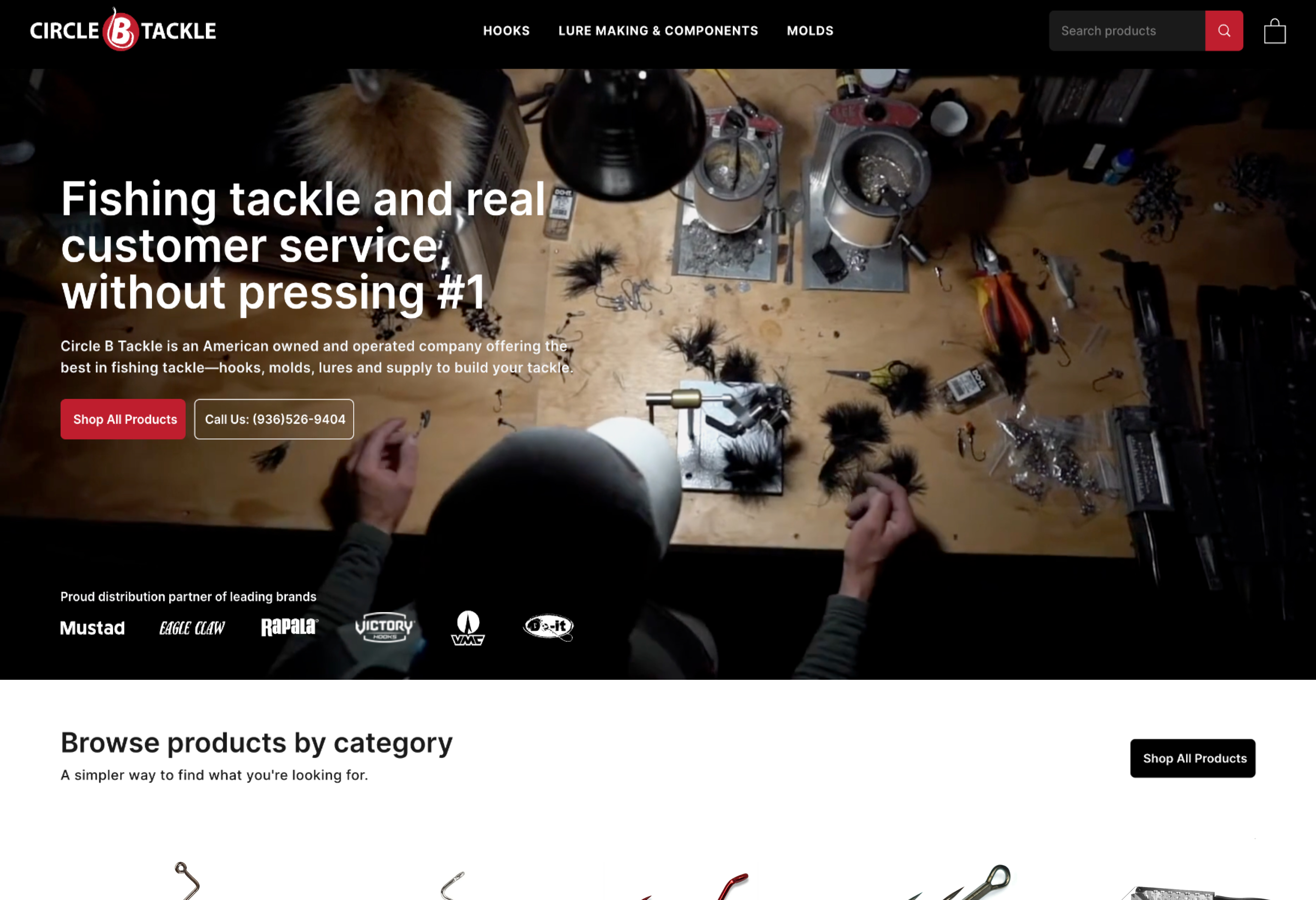
Initial launch (v1) landing page experience
This approach assumed browsing behavior. With a two-week timeline, I relied on familiar e-commerce patterns to ship quickly.
What broke
Despite directing Amazon customers to the site, customers continued purchasing through Amazon instead.
Customer behavior revealed a mismatch:
- Users weren't browsing
- Users arrived with specific products in mind
- Users expected direct access, not exploration
What worked for general e-commerce didn't work here. The system forced high-intent users into low-intent flows.
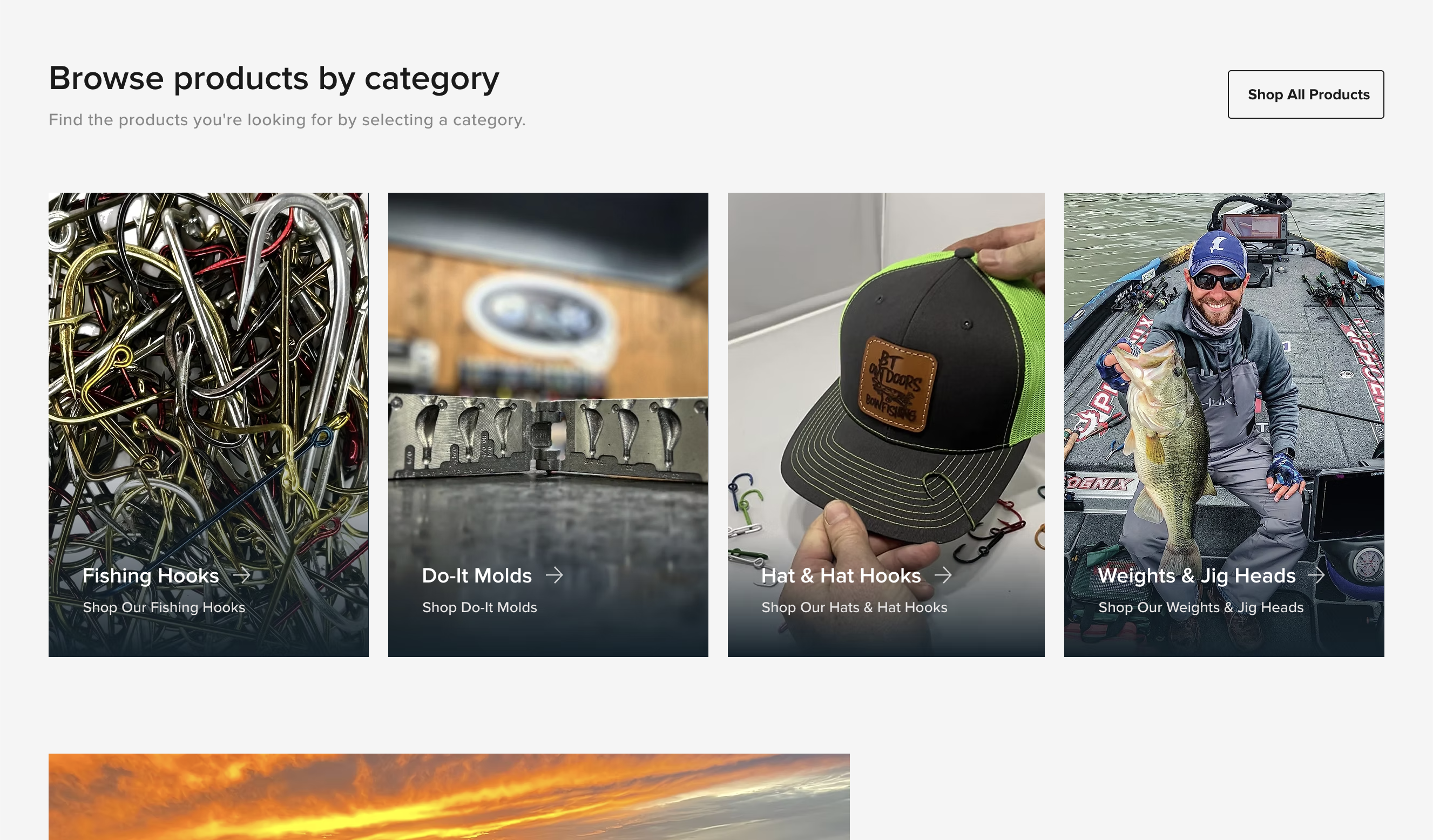
Initial launch (v1) category section
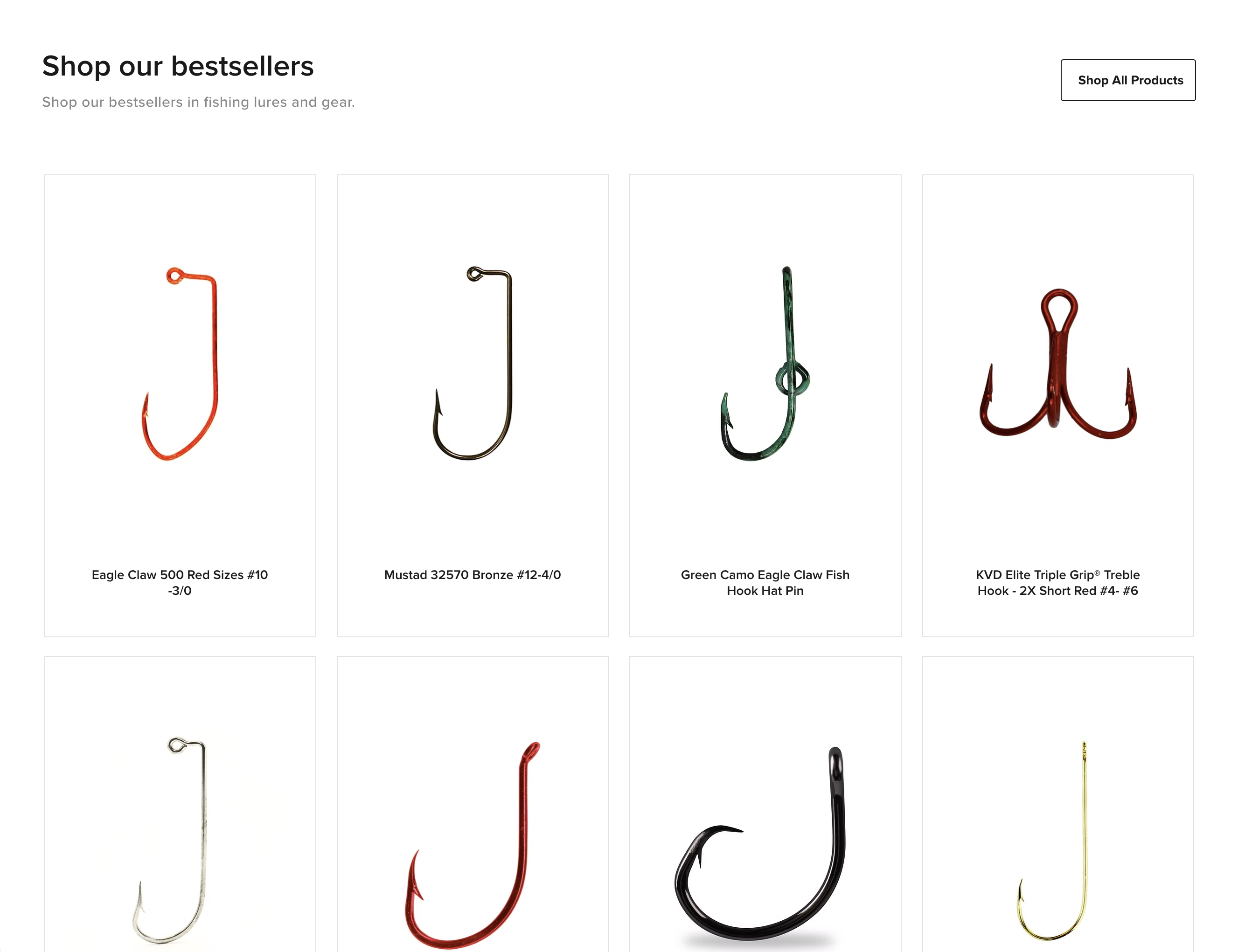
Initial launch (v1) bestsellers section
Constraints
The redesign had to evolve the existing system rather than replace it.
- The site was already live with active customers
- Product structure and inventory were already in place
- The catalog spanned over 1,400 SKUs across 500+ products
- The platform limited how deeply the backend could be restructured
- Familiarity needed to be maintained for repeat buyers
These constraints required simplifying the experience within the system, not rebuilding it from scratch.
Path to product
The homepage needed to function as a launch point for intent, not a showroom for browsing. The redesign focused on compressing the path from entry to product.
From the homepage, users needed to:
- Enter directly into a known category
- View relevant products immediately
- Move toward checkout with minimal navigation
The objective was to reduce the path to product from 3-4 interactions to 1-2.
Before
- Homepage
- → All Products
- → Category
- → Subcategory
- → Product
4-5 steps
After
- Homepage
- → Category
- → Product
1-2 steps
Structural shift
After defining a clear path to product, I shifted the site from a discovery-first experience to a retrieval-focused one.
Category structures and navigation were aligned with how customers actually think about products, using familiar terminology, accounting for brand affinity, and accommodating overlapping product groupings rather than strict taxonomy.
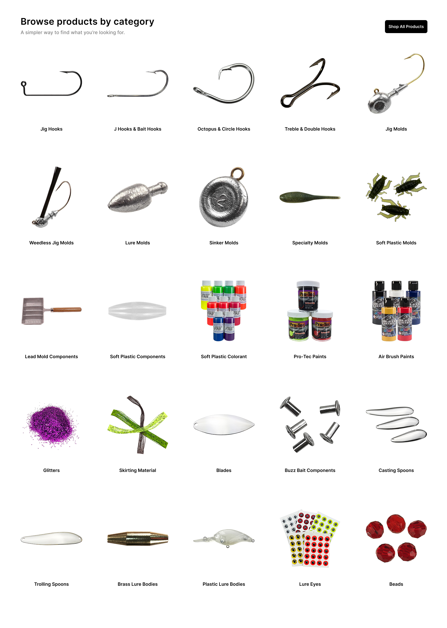
Product category entry points (v2)
Decisions
I surfaced primary product categories directly on the homepage, replaced promotional modules with category-first navigation, simplified terminology, and reduced hierarchy depth to minimize steps to product.
Outcome
Users could move directly from entry to product without navigating layered category structures, reducing friction between intent and action.
Final result
The redesigned experience aligned the site with actual customer behavior. Users could reach products in as little as one click from the homepage.
The result was a measurable shift in performance. Within a year, site revenue doubled, driven by improved conversion from existing traffic.