Eras
Interaction Model
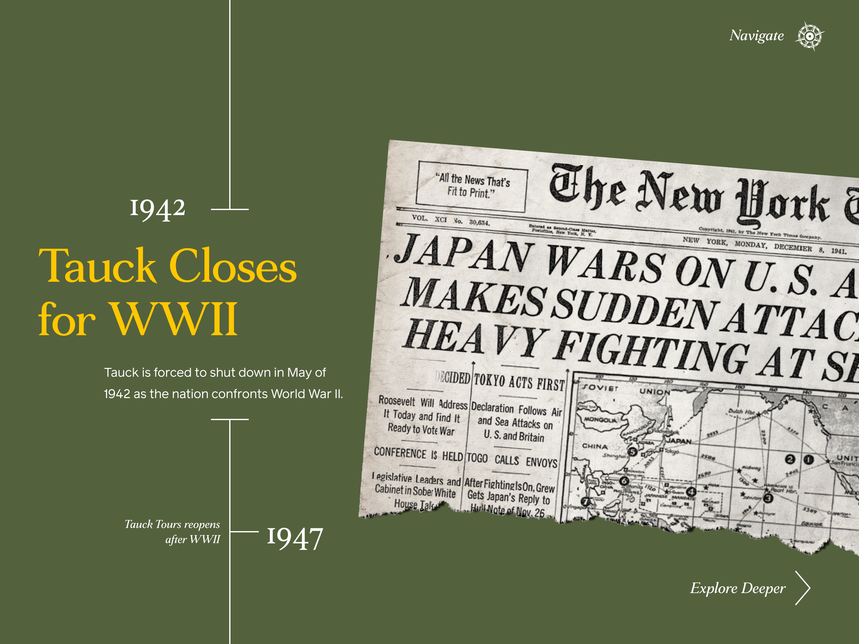
Era-based exploration with distinct visual systems per period.
Why it works
Rich, contextual storytelling that mimics physical travel ephemera in digital form.
Constraints
Would require separate desktop and mobile builds and introduced heavy hidden content.